
I’m an Anglican minister, which means that technology and I have already gotten off on the wrong foot.
Most of the churches I’ve been involved with have struggled to maintain any sort of functional website – you know, like one that tells you church service times which were accurate at any point in the last decade. Anglican churches are some of the worst offenders here – impossible to find anything, laughably out of date content, with an aesthetic which communicates effectively the message “we are not here to make things easy for you”. Nearly every newcomer I’ve ever met has googled the church first – and it seems that too often our front door actively discourages anyone from visiting the website, let alone coming to a church service.
But in the last six months I have watched in awe as a team of volunteers at our church (Barneys Broadway) have done some amazing work. It’s not ground-breaking (we’ll leave reinventing the internet to someone with a bit more capital). It’s not even finished. But already we’re seeing outcomes – more people visiting our church on Sunday who found out about our services online, and more members of our church able to access the information that matters to them.
And did I mention that they’ve done it so cheaply that even when you add up the development costs + hosting costs (+ all those late night pizzas) it’s still all up less than we were paying per year just to host the old site?
I love computer geeks. Here’s what I’ve learned from them about church websites.
The right people in the room
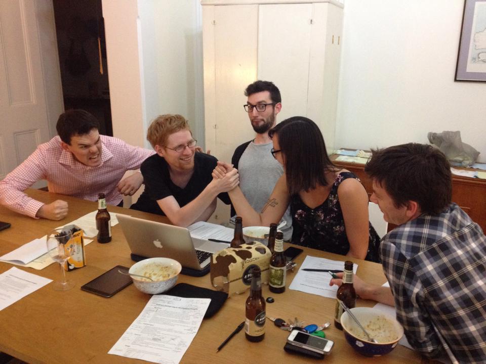
So I should start by saying that all we did (“we” being the ministry staff) was get the right people in the room, make dinner and get out of the way as quickly as possible. Mike Paget (our senior minister) assembled a team of gifted people from within our congregations:
- Nick runs Open Box Technology which consults on technology projects for churches. He project managed this website redevelopment.
- Kurt is a technical analyst at the University of Sydney
- Shelley is a programmer for Fleetcutter (the software that drives Goget car share)
- Darv is a freelance mobile app developer
- Tobias is a freelance graphic designer
Looking back over that list, we were obviously blessed by an embarrassingly high powered team – we had enough firepower to design and build a web startup from scratch.
But surprisingly very few lines of code were ever written. That’s what is so brilliant about this team. And that’s what I think more church IT projects could learn from. (By the way, I’m not assuming that all churches will necessarily have people with these skills in your church – the reason I’m writing this up is that I think many of the things they worked out for this project can be easily and cheaply adapted by other churches.)
Defining the problem
It all began with dinner, a slow cooked curry and the right people in the room. The whole process could be described as this task: defining the problem.
- What is it that we are trying to do?
- If that’s what we’re trying to do, what needs to be different or better about our current site?
1. What are we trying to do?
To answer the first question the team tried to articulate the distinct groups of people we are trying to communicate with (something a lot of websites are fuzzy about), and what those people’s questions are. We identified two primary groups of people:
- Newcomers, whose questions are:
- “What times are your services?”
- “How do I get there?”
- “What type of church are you, and are you weird/hipster/reformed/evangelical/high-church?”
- “Do you have a {insert ministry here}?”
- “Who do I speak to about …. ?”
- Current members, whose questions are:
- “Here is my money. Please register me for {this event}?”
- “What are the details about {this thing coming up}?”
- “What are the contact details for {this staff member}?”
- “Where do I find the sermons I missed?”
- “Am I on ushering this Sunday?”
Clarity on this was actually harder to arrive at that it might seem, because there are always a whole lot of other people we might like to communicate with. For instance, people who want to hire our building, alumni who want to hear about the rebuilding project, people in the community who want help with accommodation (not to mention ministers who want to promote their blog to the world!). But these are “desirables” not “must haves”.
Stats were useful here – we know empirically that almost all of our web visitors are newcomers looking for a church. To serve them well requires a focus on simplicity and accessibility. We realised that to try to do everything with one website would mean not doing this most important thing well. (We still want to communicate with these other people, of course, but we need to do so through different channels – such as the site you’re currently on!)
2. If that’s what we’re trying to do, what needs to be different or better?
The user experience was broken
- Mobile: currently almost 40% of our traffic is on mobiles or tablets, but our old website was almost impossible to use on a mobile device. This is very important now that Google gives preference in search results to mobile friendly sites.
- Cluttered: beyond the front page there were huge lists of sub pages (for example, under “what’s on”) many of which were viewed rarely and out of date.
- Unclear user flows: users had to choose between three different ways to contact us, for example. And service times were on a different page to their locations!
- Useless for existing members too: our members consistently reported being frustrated by the website frontpage which was (deliberately) largely geared towards newcomers. If you want to pay for a weekend away or check your roster, good luck finding the link.
The aesthetics were broken:
- Design consistency: no standard style guide, no consistency of photo sizes, text styles were all over the place.
- No story-telling capacity: the layout was text heavy, with no easy way to include photos or videos to tell the story of who we are.
The site was functionally broken:
- Forms for registrations were not customisable: For weekends away, for example, we could not get dietary information at the time people paid, which led to huge amounts of follow up admin.
- Social media integration: more and more people come to websites via social media referrals, not by typing in a homepage URL. We didn’t integrate with social media very well at all (what metadata comes up where you share a page on Facebook, for instance?).
The technologies behind the scenes were broken:
- Obsolete technology: our old site was cutting edge back when it was made, but it was built using a proprietary system which now is difficult and expensive to run and maintain.
- Hosting was unreliable and expensive: due to the proprietary technology, we needed to spend a significant amount of our IT budget on two different boutique hosting accounts, neither of which were very reliable or fast or capacious or had good customer support … in short, it was not very good.
- Cumbersome back end: our Content Management System (CMS) made it hard for staff to update content … so they didn’t update it. Also, access permissions were an “all or nothing” affair, so we couldn’t really give responsibility for maintaining a part of the website to a trainee, for instance, without also giving them free reign to break the whole site.
- Our site hadn’t kept up with search engines: the URLs were ugly, metadata was poor, and SEO (Search Engine Optimisation) was an afterthought.
We are not the first or only people to address this problem
Only once the problem was clearly defined did we start talking about technologies to solve it.
Looking at what we were trying to do, the team unanimously decided that we are not the first or only people who have had these needs.
- Rather than develop something from scratch (for example, writing our own code, or using Drupal as a framework – something the team was certainly able and willing to do if needed) the team investigated what open source and proprietary Content Management Systems (CMSs) were available. We settled on WordPress.
- Rather than paying to have our own server which we maintained (again, something they were ready and able to do) they explored what local and international web hosting services could meet our traffic needs most cost effectively. We settled on Digital Pacific, for which Open Box Technology is now a reseller.
- Rather than integrating our own payment gateway through our bank (which we did for our old site, but was very expensive given our small volume of transactions) the team investigated third party gateways. We settled on Stripe (for the moment, but we are looking into other solutions).
Next week
With a better idea of the platform we would use, the next task was to create and test a site map which would help people find what they want, the first time.
Hi Andy and team,
Brothers it is good of you to go to the trouble to help the Kingdom and the yet to meet Jesus folk by spending the hours to pass on your experience
We down in Wanniassa are trying to rebuild our website
The old site you replaced our team thought was one of the best they had found – but it was already yesterday
Just wanted to express our gratitude for your generosity of spirit in sharing
ian powell (Vicar of Wanni)
This is a such a fantastic resource, I keep coming back to it again, and again!