To save time and money, the team decided not (at this stage) to commission a specialist web designer to create custom templates and stylesheets for our pages. (This is something which we could still invest in in the future, but for now we were pretty confident that the biggest improvements were to be made elsewhere).
Instead, we looked for a simple mobile friendly WordPress template which we could quickly customise according to our style guide. We ran with “Generate Press”, a free template which got our site up and running with minimum fuss.
Style guide
What made this easy was that Tobias, our design guru, had already done substantial work developing a church-wide style guide for all our print and online collateral. The web team could then customise the template to meet the style guide’s specifications.
Colours
Based on our church logo, Tobias set out the seven colours which should be used on all our media.
#E72757#5E3655#2792C0#FFFFFF#CBCFD5#45474C#1F2022
Fonts
Tobias also made some font choices:
- Logo type – XXII Menga (Only ever used in the logotype. Never anywhere else. Ever)
- Signage around the church – Bariol (regular)
- Website title – ITC Avant Garde Gothic Pro (Demi) 32pt
- Website subtitle – Helvetica Neue Bold 22pt
- Caption font – ITC Avant Garde Gothic Pro Demo 20pt
- Body font – Helvetica Neue Regular 12pt
- Quote font – Times New Roman Italic 12pt
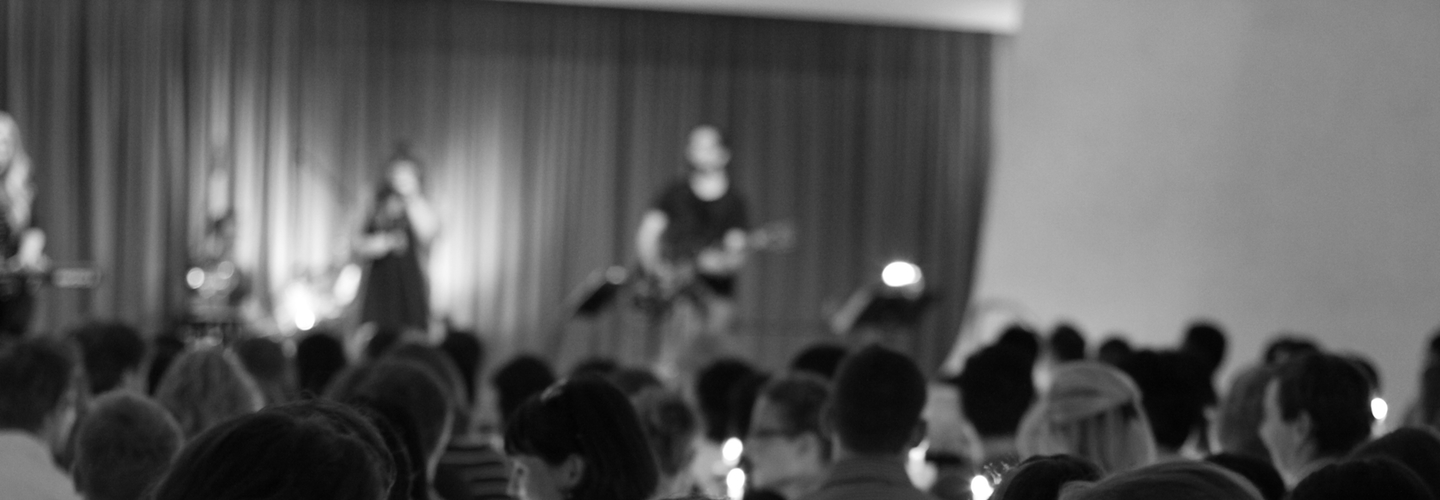
Photographic images
One of the issues identified in our early “problem defining” process was the need to communicate about our church through good visual storytelling. Our previous site was very text heavy, and while we had some nice photos of our congregations they were hard to incorporate in the previous design.
The template we went with allowed large desaturated images to act as the header of each page – we asked one of our amazing volunteers (Ben) to take some photos of our congregations to show visually what our services are like.
But lots of people will be involved in adding content to the site. How do we ensure that a consistent visual story is told? Tobias wrote this basic guideline for keeping consistency in our photos:
“Our style guide favours photos taken on DSLR cameras with a relatively shallow depth of field. The photos used on the website will tend to have slightly increased contrast levels, saturation levels, and have a warm hue. The captions used on photos should appear when the mouse goes over text.”