Having defined the problem to be solved (see part 1) we began a process of clarifying our content, by answering these two questions:
- what content do we really needed on the site, and
- how should it be arranged so people can find it?
This was very much a back and forth type process – try something, test how it works, get feedback, change something, repeat. In fact, we are still in the middle of this process – trying out the new layout on real users and gathering data on how quickly they find what they want.
Our tools for this step:
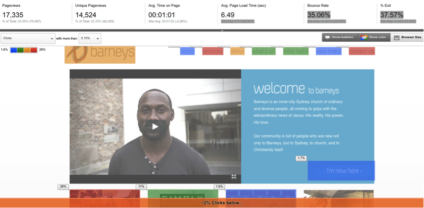
- Statistics on the current site: what people are actually looking for, and how quickly they get there.
- User testing: giving people a task (“find the sermon from this Sunday”) and watching them do it.
A guiding principle for this step could be Seth Godin’s classic TED talk “this is broken“: if something is annoying or difficult to find then it’s not because the user is stupid, it’s because the site is broken.
Our old site map
A site map is a list of all the pages of a website which are accessible to users. It hopefully gives some idea of how the pages relate to each other logically (“what we believe” comes under “who we are”).
| Home | Services (including service times) |
About (including page about Barneys) |
What’s on (Defaults to discover more about Jesus) |
Bible Talks (Latest bible talk & videos) |
Next Steps | Contact us (Contact details) |
| I’m New Here
How to get here Accessibility Let us know you’re coming BOCC |
What we believe
Location Accessibility Our stories Meet the staff team Our Council and Wardens Fire & rebuilding Integrity & transparency Contact us |
Christmas
Professionals, postgrads & tradies Tertiary Students Barneys Youth Families
|
Listen to talks podcast
Subscribe using iTunes |
Let us know you’re coming
Get Help
Discover more about Jesus Join a growth group Start Serving
Give money Update my details Credit card payments Volunteer Login Rebuilding
|
Let us know you’re coming
Staff team Booking Barneys |
As you can see, years of slowly adding pages with little big picture planning led to a bit of a mess of pages.
- Content appears in multiple places (contact information, for instance, shows up in at least two different sections)
- Content which should be together is split over multiple pages (people who want to know what time our services are will also want to know where they are held … but service times and location are on different pages)
- The top level names give few clues as to what is underneath them (what is “next steps”? Only clicking will show you).
New site map version 0.1
After a lot of massaging we managed to reduce the number of pages substantially. The way we did this was by starting from the user’s point of view: why do people visit our site, and what do they want? (percentages reflect approximate number of users)
- Newcomers want information about when and where our church services are (22%), what our church is like (10%), how to contact us (8%) and (interestingly) who our staff members are (4%).
- Existing members want to sign up for events and courses (16%) or listen to sermons (10%).
- Both new and existing members want to know what events are on (10%)
| Home (Including video, service times, what’s on) |
Come to church (Including location, transport) |
Who we are | Get involved | Media | My barneys | Contact |
| (Hire barneys)
(Privacy policy) |
(Mandarin services page) | What we believe
Meet the pastoral team Our building Integrity & transparency |
Professionals, postgrads & tradies
Tertiary Students Barneys Youth Families ——— Find out about Jesus Weekends away Love your neighbour Join a growth group Use your gifts |
Bible talks
Music Mountain Street Media |
Event calendar + registration
Make payment Next steps Rosters (elvanto) |
Contact details
Get help with something Staff contacts (Social: facebook) |
Our goals were:
- to reduce how far people need to go to get answers to common questions (i.e. putting service times on our front page)
- to reduce the total number of pages (for example, having one page for all the information families might need, rather than a separate page for each ministry that serves families). Our new site map has the same number of pages in total as used to be under one single section.
- to put information for current members under a single heading (“my barneys”). We debated what to call this quite a bit – “members only” would be too unfriendly, “community” too vague”, “member portal” too clinical.
It’s still early days and some tweaking will no doubt be required, but so far the feedback and the stats are encouraging – people are finding what they want more quickly.
Next week: making a styleguide to integrate our church branding across web and print media.
1 thought on “How to make a good church website (part 2) – site map”
Comments are closed.